As per users surveys, usability testing and users feedback I found a problem that John Deere Sales Center (JDSC) was not supporting responsive behaviour.
JDSC was not at all responsive, when this project started the targeted resolution is only desktop, because JDSC is a replacement of multiple individual applications that John Deere dealers are using to complete the sales process. JDSC is an initiative for end-to-end sales process, used by John Deere Dealers.
- Collaborated with product owners to collect and comprehend the requirements.
- Designed low-fidelity wireframes, high-fidelity prototypes, and workflows.
- Designed interactive prototypes for all the resolutions.
- I ensured that John Deere and global standards were followed to ensure consistency and compatibility across all resolutions and devices.
- Responsible for creating style guides and implementing new technologies such as Flexbox and CSS Grid to achieve responsive behaviour.
- Implemented a responsive design initiative to ensure compatibility with various browser resolutions and devices.
- Analyzed user research survey results and worked on developing a better user experience design.
- Embedded in Agile project management methodology.
Based on the analysis and study of user surveys, usability testing, and user feedback results, I created a persona.
- Who are the users?
- What are there roles?
- Why they want responsive behaviour?
- What are there targeted devices and resolutions?
General approach for responsive design is called Mobile first, but in JDSC I called this as a Mobile ALSO as I implemented responsive behaviour lately in our application.
- I analysis the devices that dealers are using in the dealership to complete the sales process.
- I did the research on what all are the popular devices in the market.
- During my research I found that there are many devices in the market so I cannot target the devices and devices may come and go in future but if I target the resolution sizes than that will cover all the devices.
- Then I started my research on what are the common sizes I have to consider so that my application will work on any resolutions and devices.
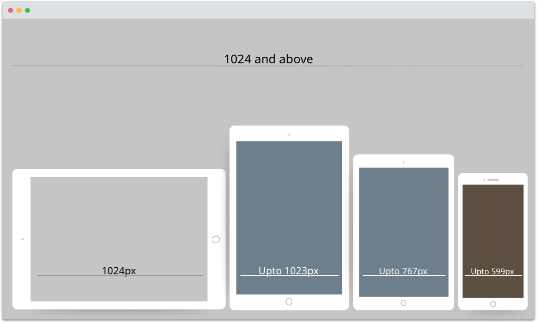
- Here are the results of my research on sizes, technically called as break-points in css:
- Upto 599px
- Upto 767px
- Upto 1023px
- 1024 and above

I considered only 4 sizes for the break-points as these covers all the resolutions.
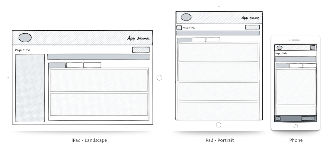
Wireframing is the best techniques for quick iterations.
- I worked with the product owners and understand, what all are the important contents/sections that I need to keep visible for the users in all the resolutions.
- I started wireframing and whiteboarding and reviewed with the product owners.
- I did update the wireframes besed upon the discussion and feedback from the product owners (quick iteration is the beauty of wireframing).
- Few sample wireframes.

High fidelity screens established a realistic experience to encourage useful stakeholder feedback.
- I created hi-fi interactive prototypes based upon approved wireframes
- Performed usability testing on prototypes in all resolutions with the leadership and dealers to get the real feedback.
- Enhanced the prototype based upon feedback.
- Few sample hi-fi mockups.
- After implementing the responsive behaviour now dealers are free to use any devices to run the application and complete the sales process.
- They are also seeing the consistency in the design and functionality between the different modules which is enhancing the user experience.
- Dealers are free to work with the customers while showing the machines in the inventory area as they are running the application on phones and ipads , earlier they have to go back to there desk and work on the desktop to complete the process.
- This responsive behaviour reduced the time to complete the sales process.
- Main challenge was in the development.
- How we can align all the developers and architects so that they can use the same approach to implement the responsive behaviour so that our code is consistent.
- As JDSC is a very big application and many developers are working in this project and every developer have different approach to work.
I conducted a responsive design thinking workshop and guide the whole organization about responsive design concept and implementation.
- What is responsive design?
- Why we need responsive design?
- How to achieve responsive design?
- What is the best approach?
- Whole organization understand the importance and concept of responsive design.
- All the developers and architect were on the same page about the technology and concept.
- I introduced new technologies like Flexbox, CSS Grid.
- With this common css technology our code is consistent.
- After successfully implementation of responsive behaviour, as a organization we learned that we have to follow the mobile first approach.
- Mobile first approach will save lots of time in design and development.
- Now for any new features I am designing the wireframes and mockups for all the resolution (Phone, Tablet, Desktop).
- I am designing the style guide for all the resolution and for all the features, that helps developers to code correctly.
- I am taking care of all the css and responsive behaviour in the application.
- I am reviewing other developers PR (Pull Request) related to css and responsive functionality, so that I will guide them if there are any better ways to achieve the results.
- Developers learned new technology.